Once Upon A Product
The Challenge
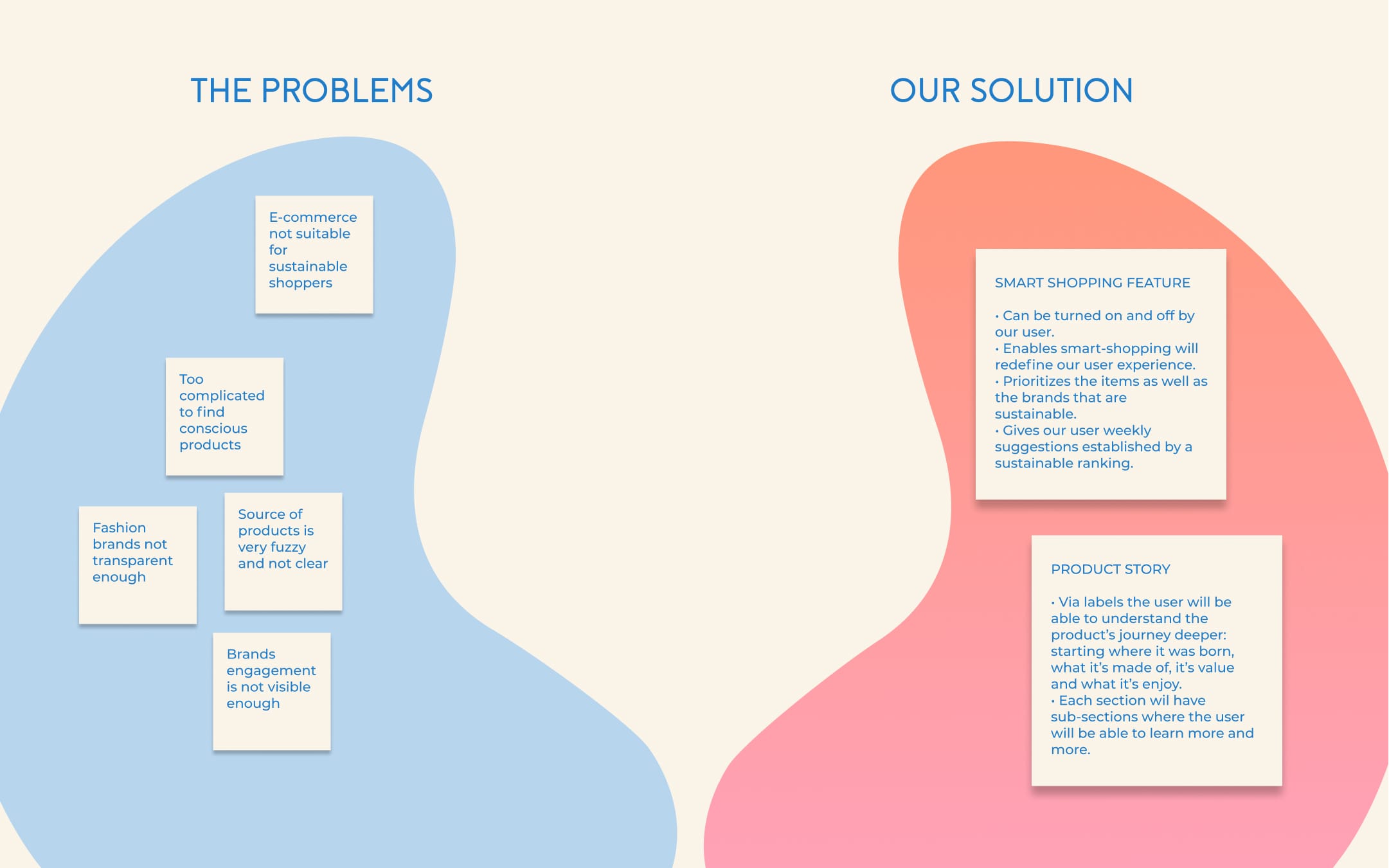
Picture this: e-commerce services educating and driving sustainable behaviours. But I mean, really driving sustainable behaviours so their users could support fashion brands that are moving forward, stirring the fashion and retail ecosystem: from products lifecycles to fabrics and transportation used to costs transparency.
For this study, one of my goal was to combine one of the 2020 UI trends with great UX design. The storytelling trend appeared to be quite obvious and relevant.
Scroll to the end and you'll be able to give the app a try!

Understand.
Having studied textile design, worked in retail and being an online shopper myself I already knew finding sustainable products and getting a clear understanding of costs was not an easy task. I started my journey trying out dozens of e-commerce services: from brands's websites to fashion retailers. Sustainability was present but never the focus.
Methodology
Competitor analysis | Problem statement

Observe.
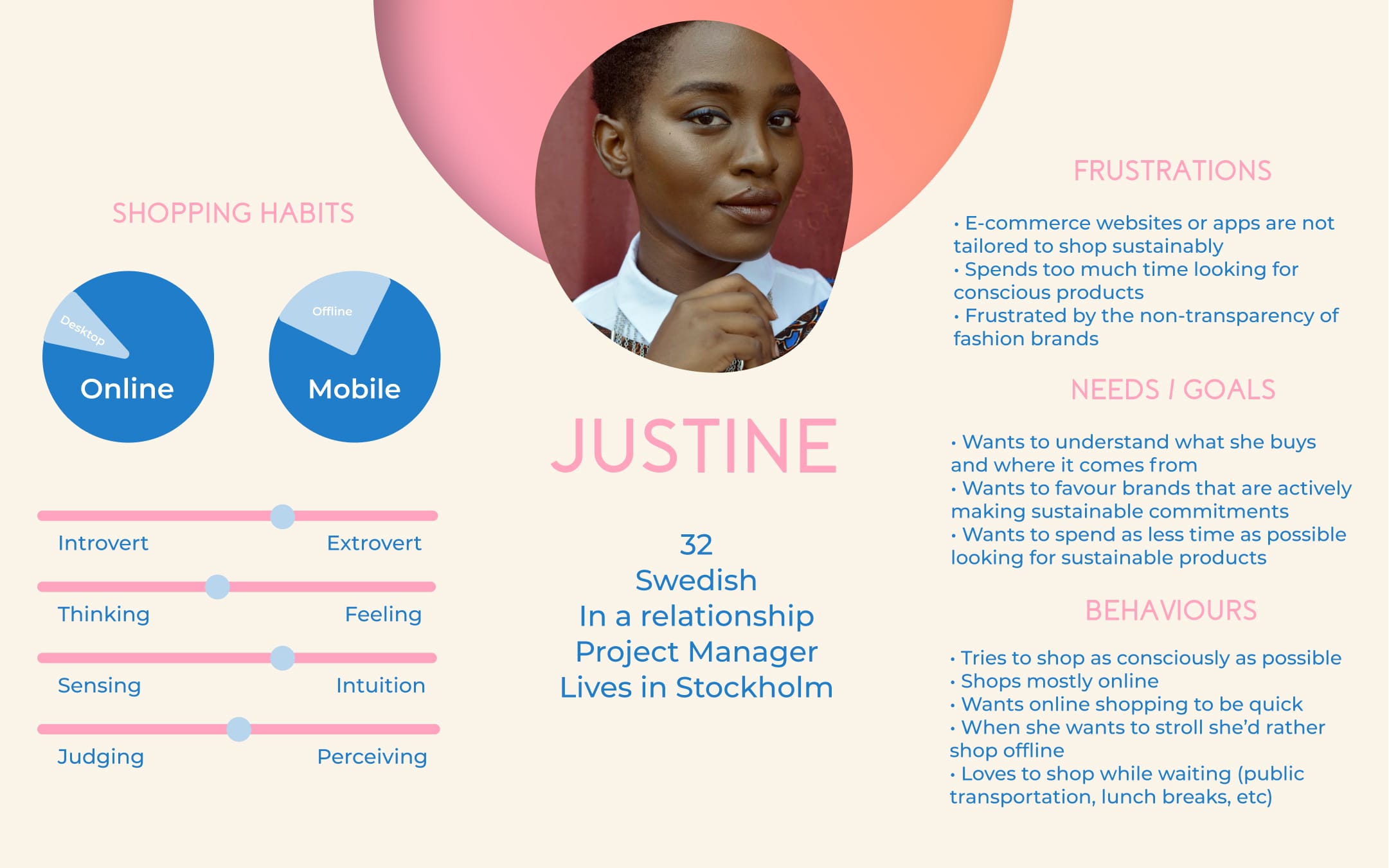
Gathering information via user research helped me understand my potential users pain points,challenge my assumptions and dig deeper into the core of my problem. Structuring this data into specific behaviours, needs and goals as well as frustrations helped me visualize my main persona. With a good understanding base of my challenge I was set to start prototyping.
Methodology
Surveys | Interviews | Proto-personas

Prototype.
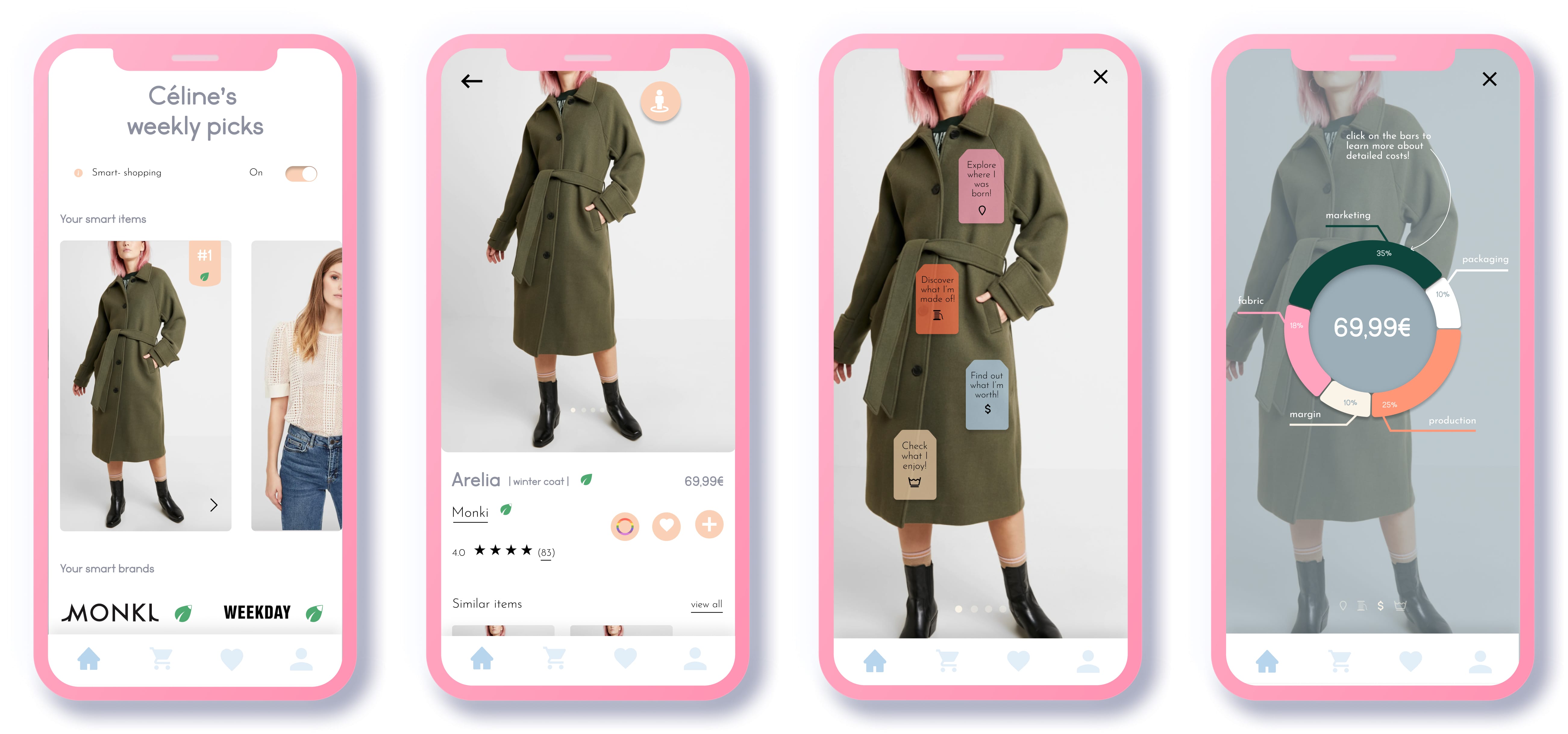
With my persona's needs and goals in mind I started drafting my first screens.My focus? Designing a unique story via my "smart-shopping" feature. I based my first wireframes on the Zalando's flow so the concept and idea could be replicate easily on any fashion retailer's website.
Methodology
Rapid prototyping | Low-mid fidelity wireframes

Test | Iterate.
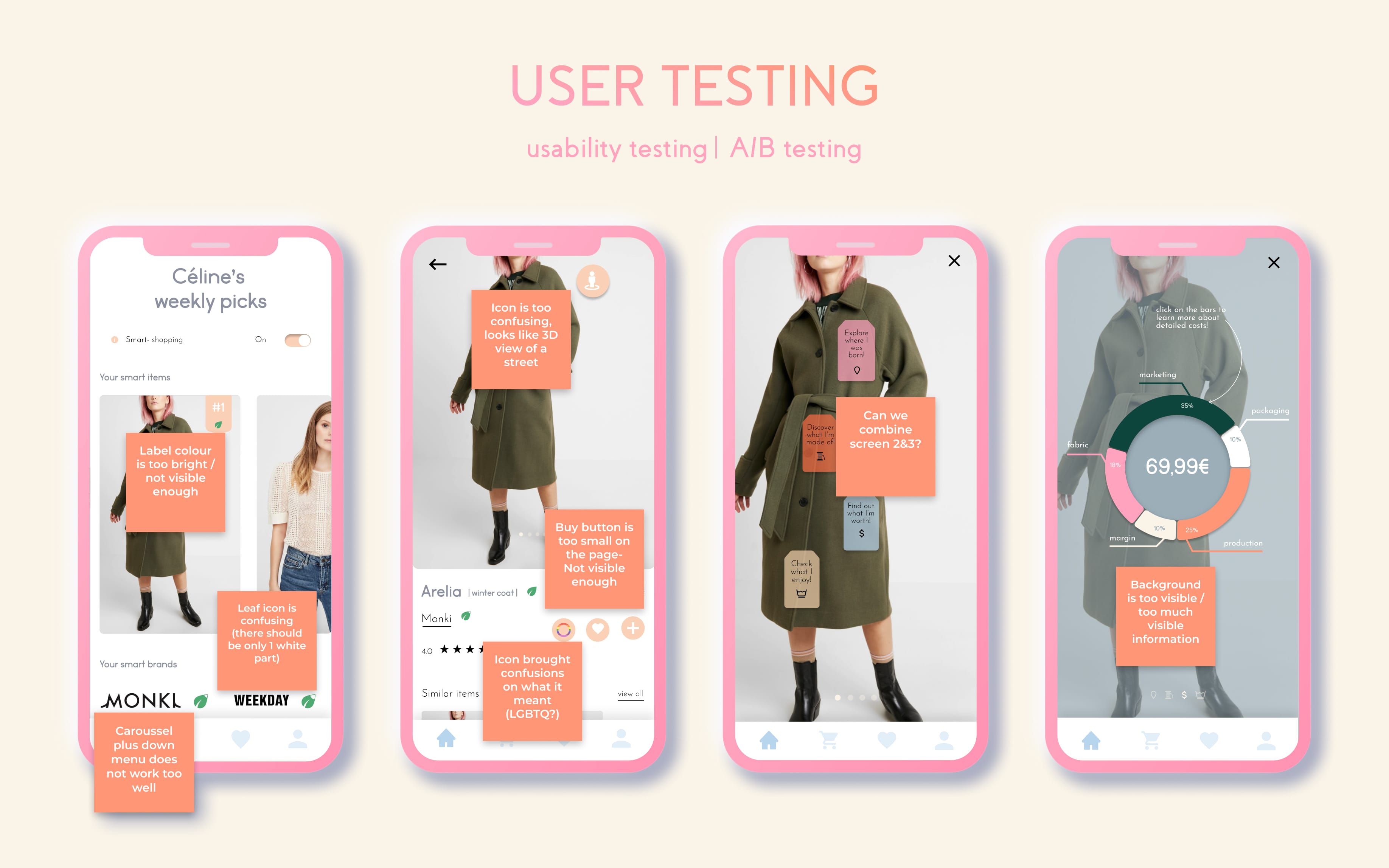
Organising and conducting the first testing session enlightened me on the inconsistencies of my prototype: screens could be condensed in order to have the smoothest possible flow for my user, icons should be clearer so the right infos would not be missed, some navigation should be reviewed to comply to technical requirements | First iteration | Second testing session | Second iterations | Third testing session | Third iterations | Fourth testing session | Fourth iterations...
Methodology
Moderated remote tests | Preference tests

Refine.
One last round of testing asking peers to try out my prototype's final version confirmed to me that there were no more major issues and that my solution was resolving the major points and frustrations encountered at the beginning of the challenge.
Methodology
Three levels of design | Peers collaboration

Try it out!
Now is your time to try out the final version of the prototype: scroll, swipe, click and drag. The prototype was done using Figma prototyping tool. You can just give it a go on this page, no need to create an account or enter any info.
