Marvellous Savings
The Challenge
What if saving money towards concrete reachable goals could be as simple as watching a Netflix tv show? You'd just have to sit there, pick something you like and everything else would take care of itself. Nowadays, most people don't actively save money simply because they don't see concrete results or that setting it up with a traditional bank seems tidious. My challenge was to design a solution that would provide potential users with an all-in-one service that would:
1- Suggest them a monthly saving amount based on their current expenses.
2- Equip them with potential saving goals
3- The possibility of spending their saved money directly from the app.
The concept behind this project was created using the SCAMPER technique.
The UI was inspired by the NEUMORPHISM 2020 trend.
Scroll to the end and you'll be able to give the app a try!

Understand.
A few months ago, I embarked on a journey to find the perfect banking app. I tried a few and some of them had really cool features like getting direct notifications as soon as you spent money, classifying your expenses, sharing trips with friends, etc. However, I did not find one that made saving money an easy job. So I went back to my traditional bank and gave up on saving money efficiently. Thanks to that journey, performing a broad competitor analysis was easy and helped me define clearly what my problem was.
Methodology
Competitor analysis | Problem statement
Observe.
Was I an isolated case? I performed online surveys in order to grasp my potential users's behaviours when it came to saving money. What were they already doing / not doing? Did they wish for a solution or not necessarily? Thanks to these surveys I was able to draft my proto-persona, pain point my main problems and start imagining what my solution could look like.
Methodology
Surveys | Interviews | Proto-personas
Prototype.
Using rapid prototyping as well as paper sketches I started working on my wireframes. Fintech being quite a trend I also researched on several platforms like Behance, Dribbble or even Instagram what already existed and what was already designed in order to stimulate my inspiration.
Methodology
Rapid prototyping | Low-mid fidelity wireframes
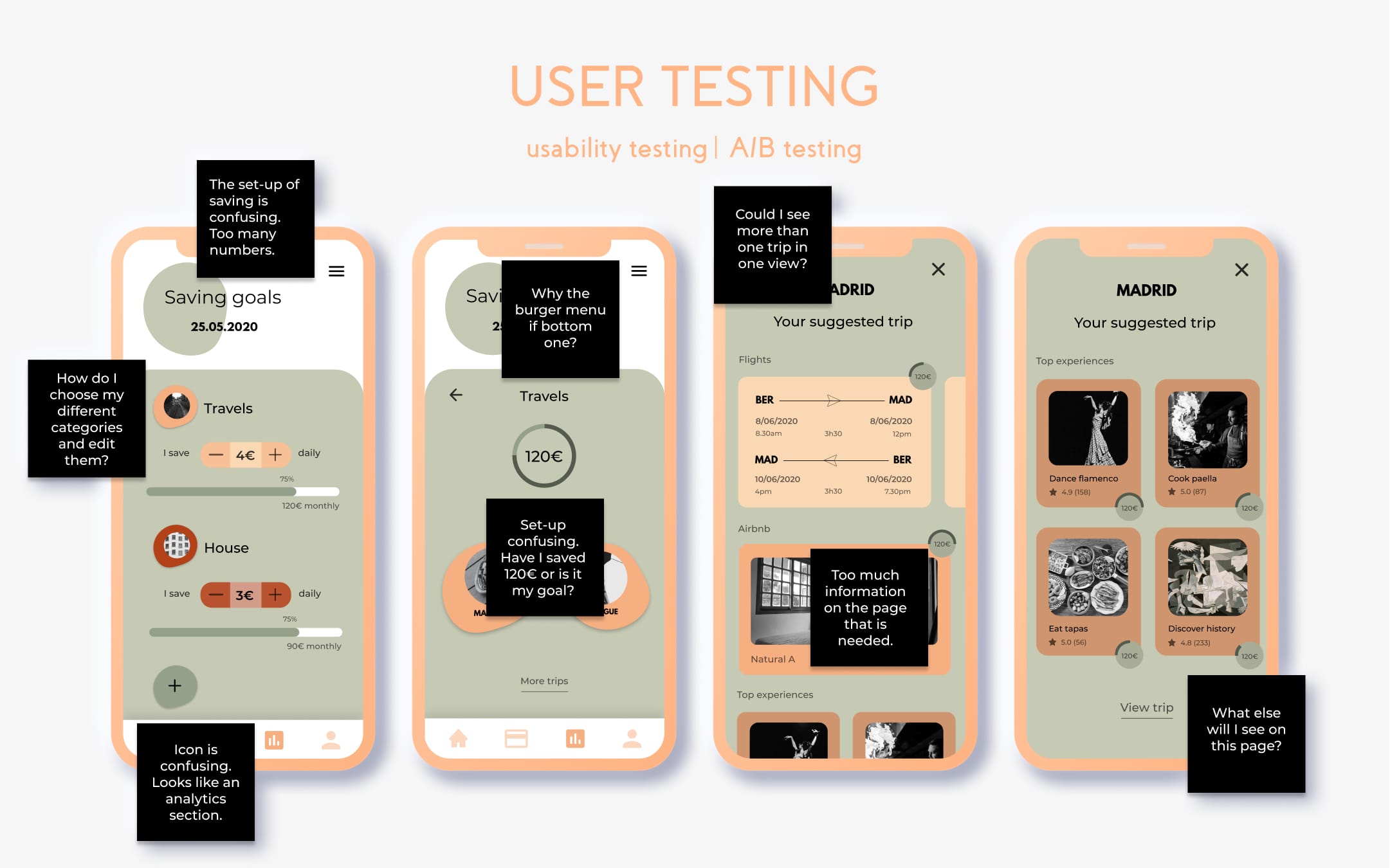
Test | Iterate.
Organising and conducting the first testing session enlightened me on the inconsistencies of my prototype: my initial flow was confusing, the numbers didn't make sense neither did their visual representation. I had to find the right balance between useful and secondary information | First iteration | Second testing session | Second iterations | Third testing session | Third iterations | Fourth testing session | Fourth iterations and so on until my final version. (It took 8 testing sessions in total).
Methodology
Moderated remote tests | Preference tests
Refine.
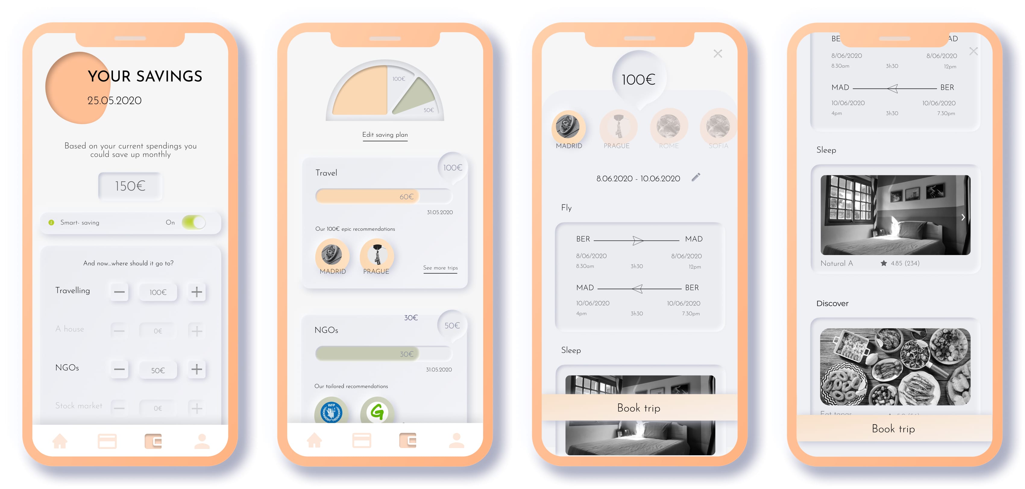
One last round of testing asking peers to try out my prototype's final version confirmed to me that there were no more major issues and that my solution was resolving the major points and frustrations encountered at the beginning of the challenge.
Methodology
Three levels of design | Peers collaboration
Try it out!
Now is your time to try out the final version of the prototype: scroll, swipe, click and drag. The prototype was done using Figma prototyping tool. You can just give it a go on this page, no need to create an account or enter any info.