
ExpertsLab
The Challenge
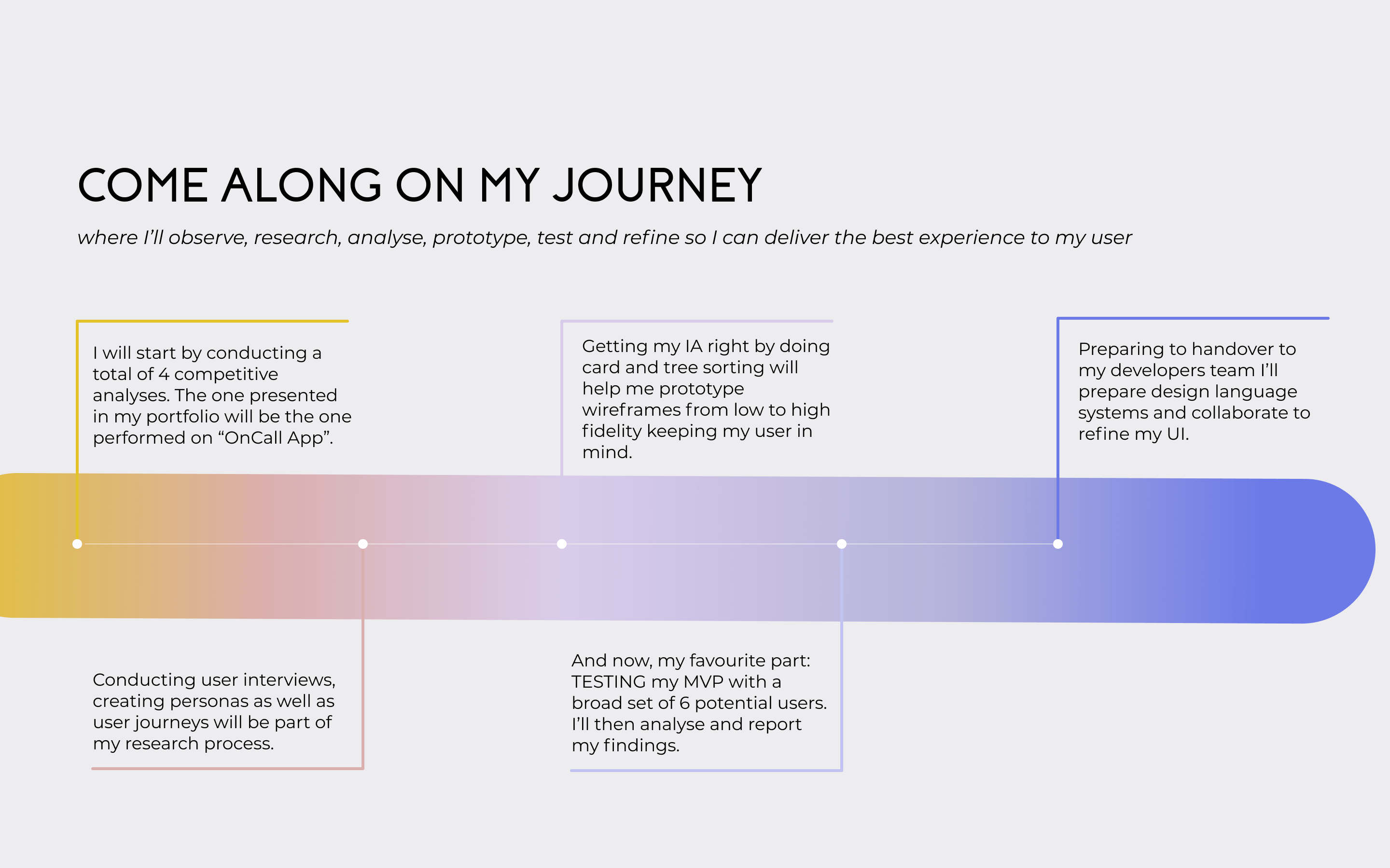
Remember that last time you wish you knew how it worked!?
We all need the advice of an expert sometimes, and how-to videos don’t always cut it. The goal
of this app is to give people a simple, intuitive way to connect with an expert in nearly any field within seconds so they can feel more informed and more prepared to face their everyday (and not-so-everyday) problems.This project was built following the complete Design Thinking Method.
Scroll to the end and you'll be able to give the app a try!
Understand.
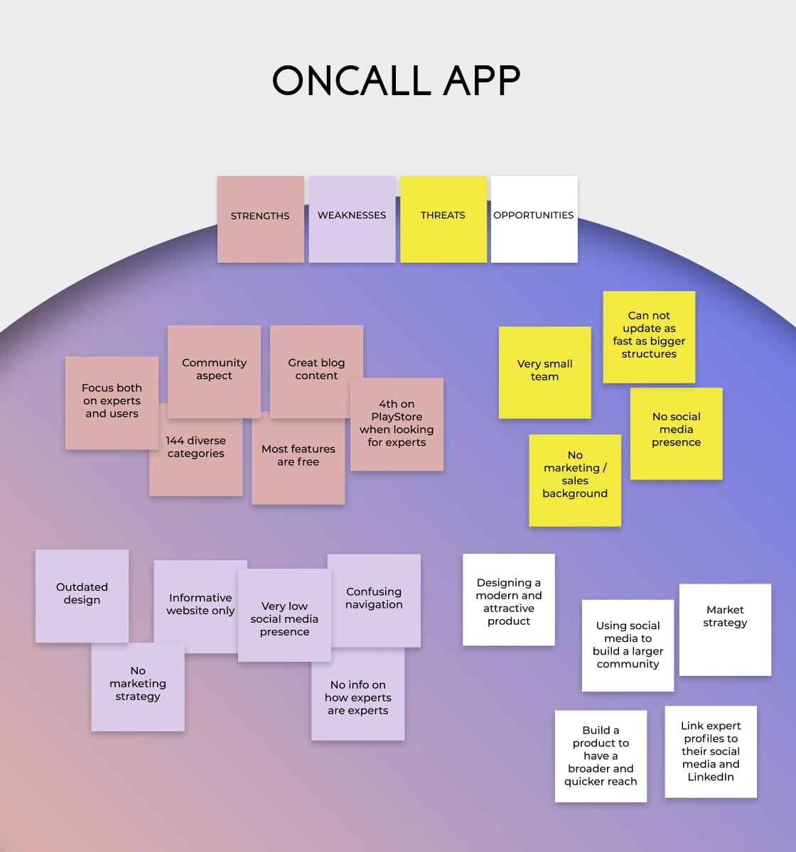
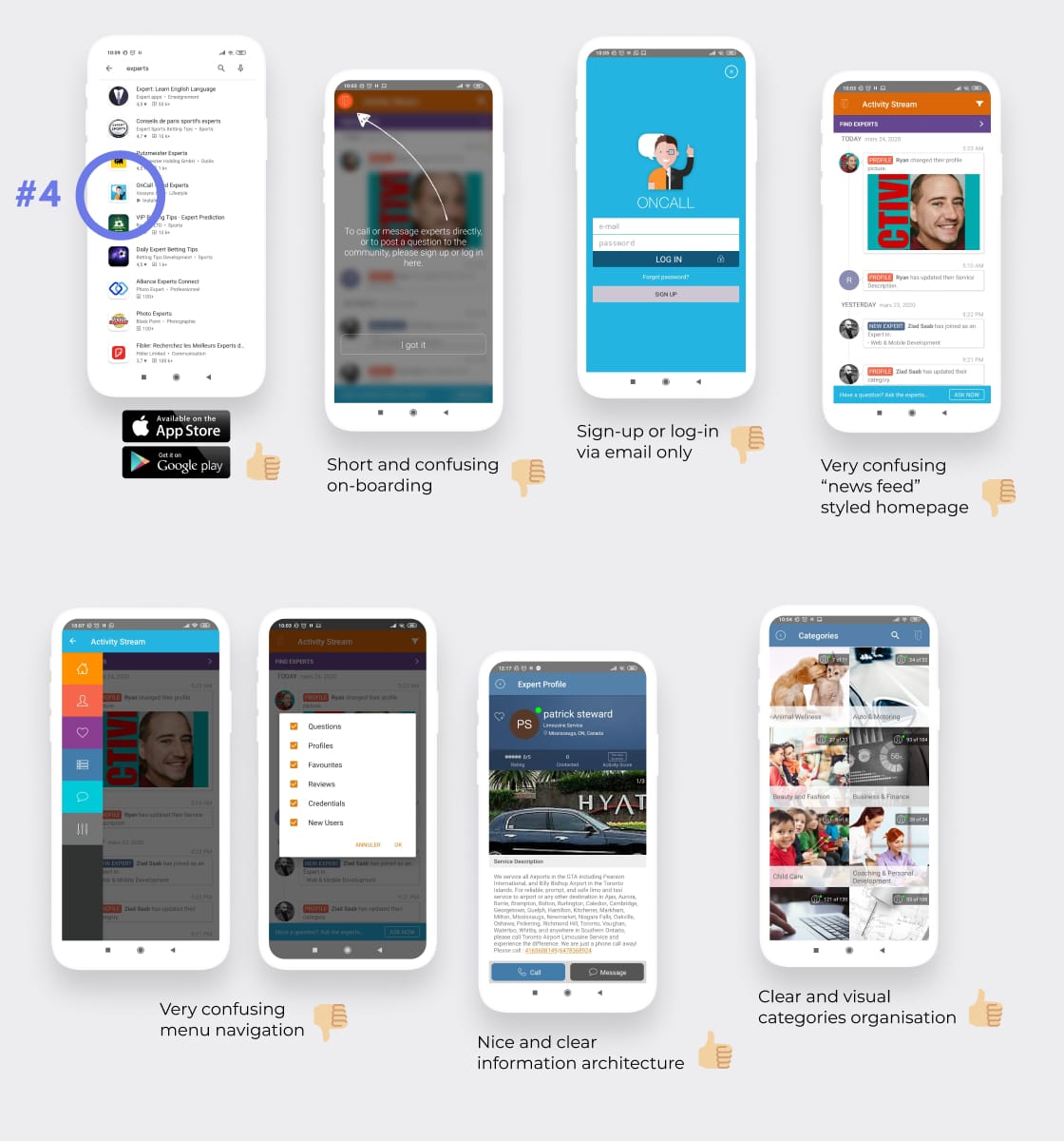
In order to understand my problem better I conducted several competitor / UX analyses.
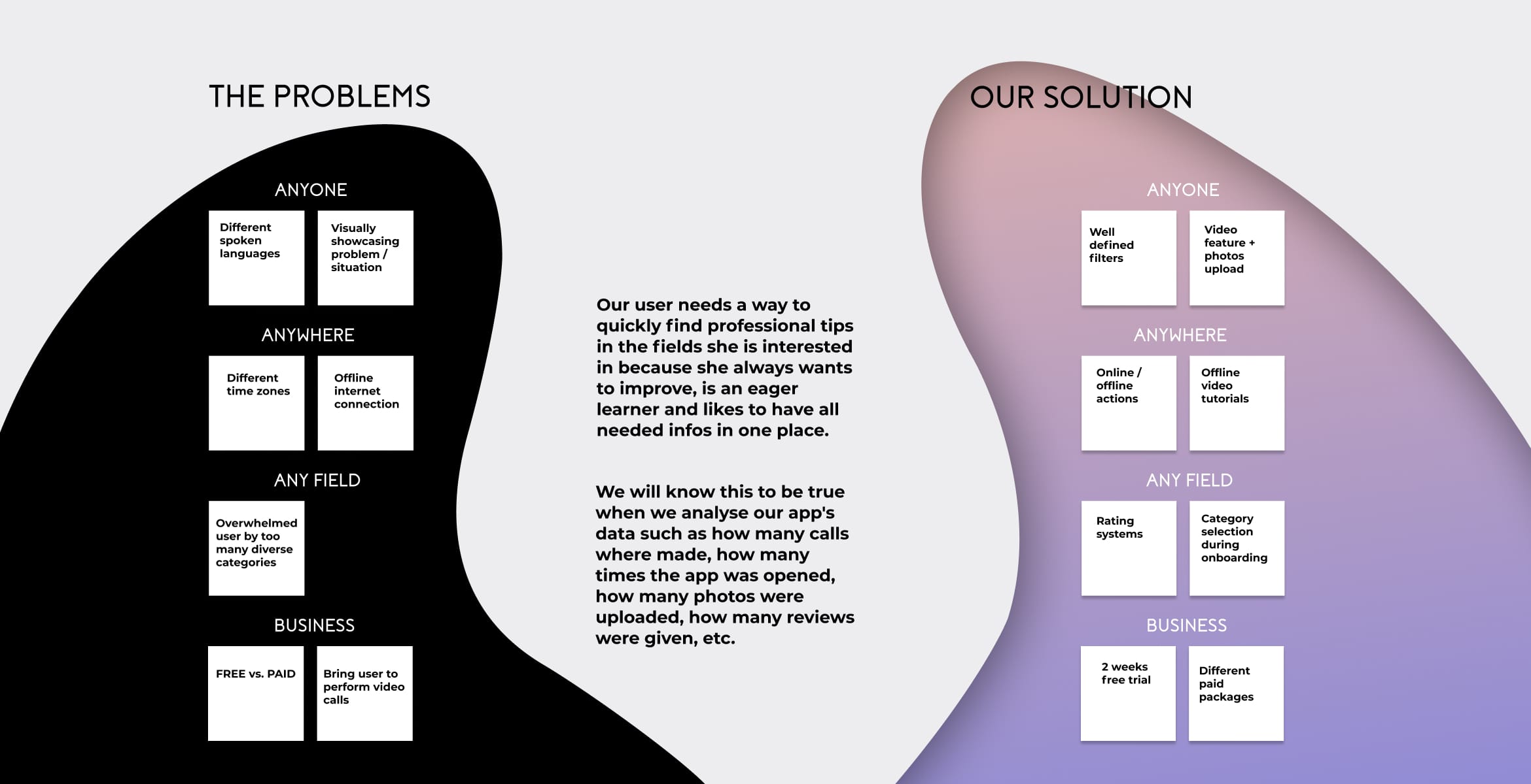
The one conducted on the "OnCall" app turned out to help me define my problem best, understand the value of a new product on the market as well as making better-informed decisions about my overall strategy.
Methodology
Marketing | Business | SWOT | Profiles
Tools
Miro | BRD (Business Requirements Document)
Observe.
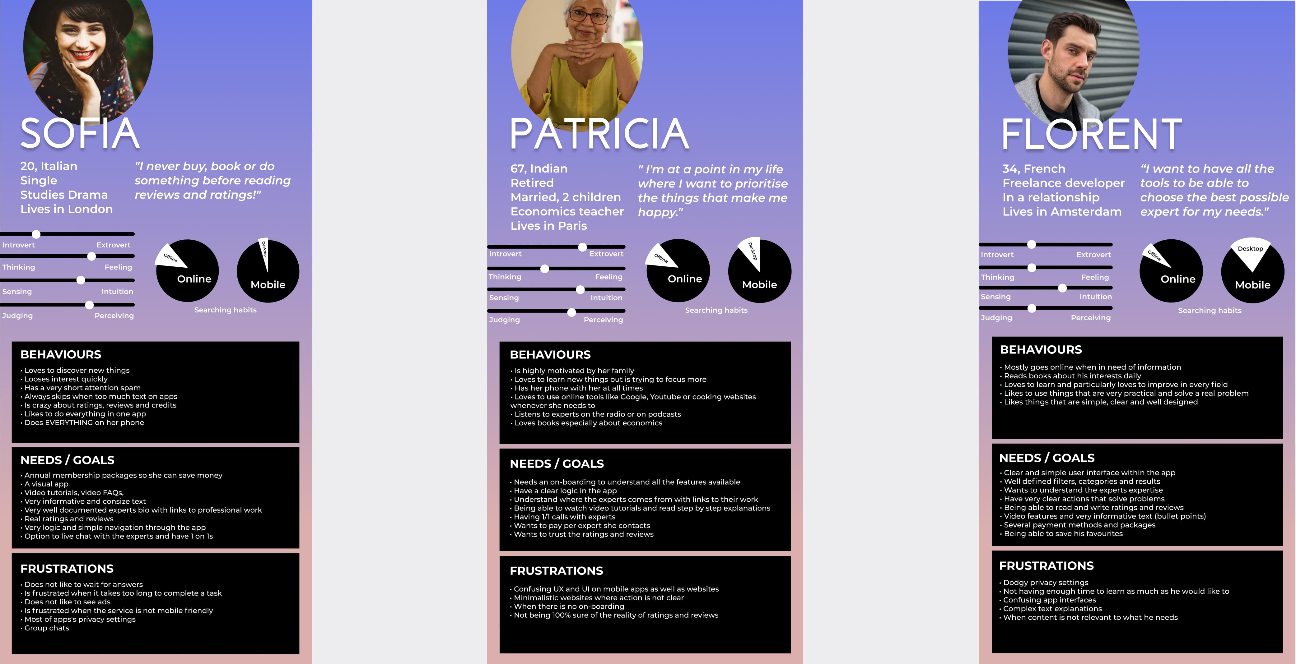
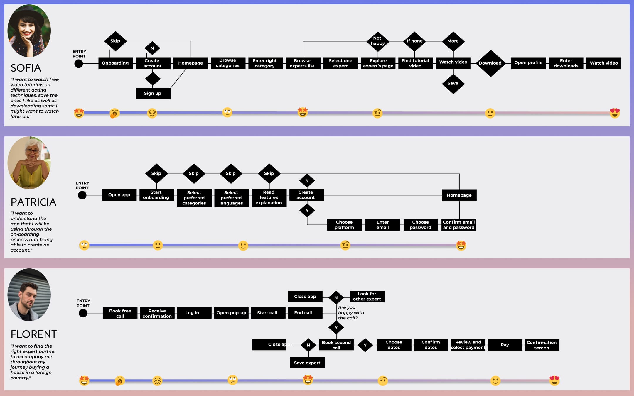
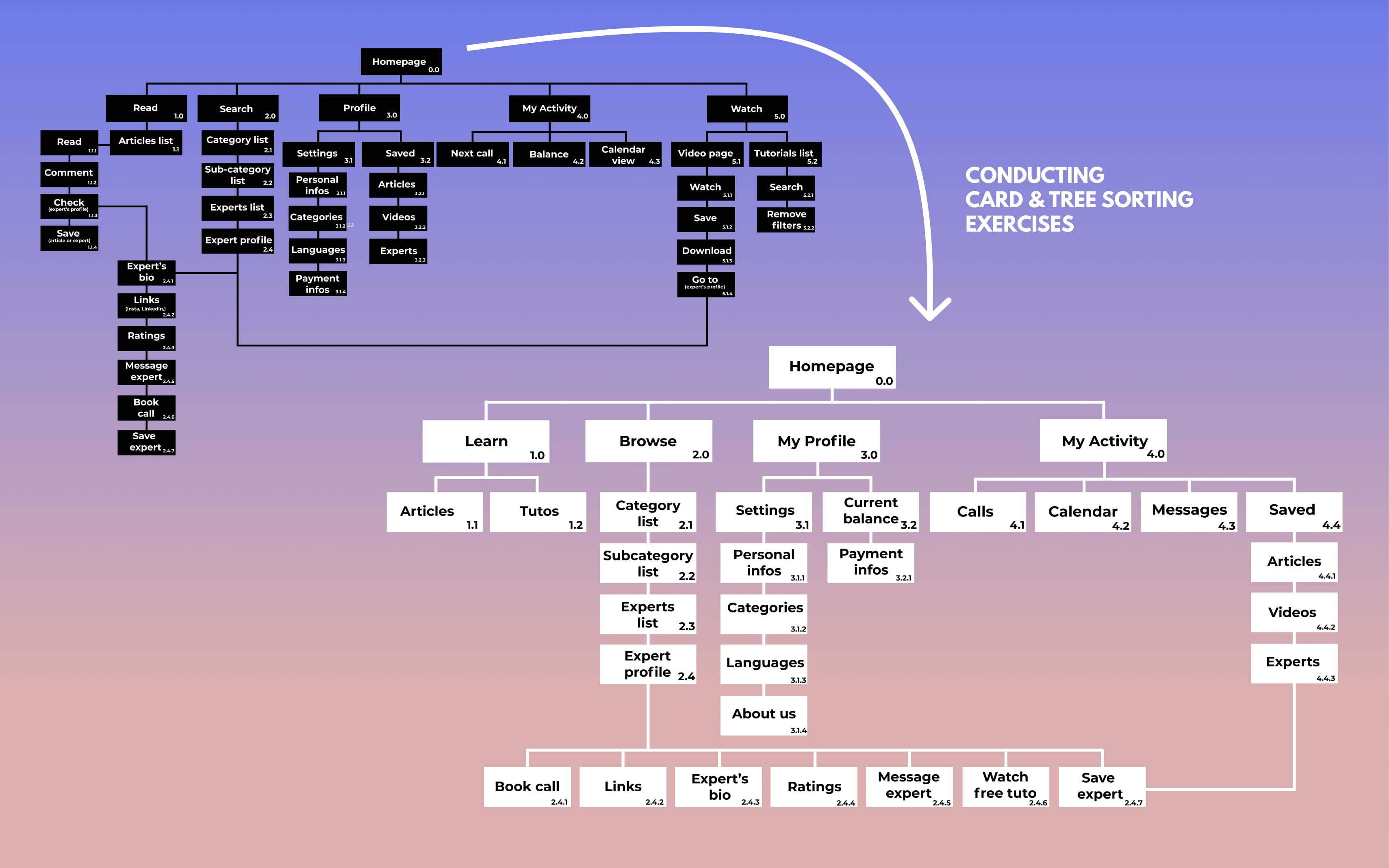
By talking to a lot of potential users, ranging from 20-years-old students to 65-years-old retirees, I was able to start grasping the core solutions to my problem. From this valuable data, I then drafted three personas that represented their gradient of behaviours as well as my sitemap defining information architecture.
Methodology
Surveys | Interviews | Proto-personas | Task analysis | User journeys | Card and tree sorting
Tools
Sticky notes | Mental model diagram | Typeform | Optimalsort
Prototype.
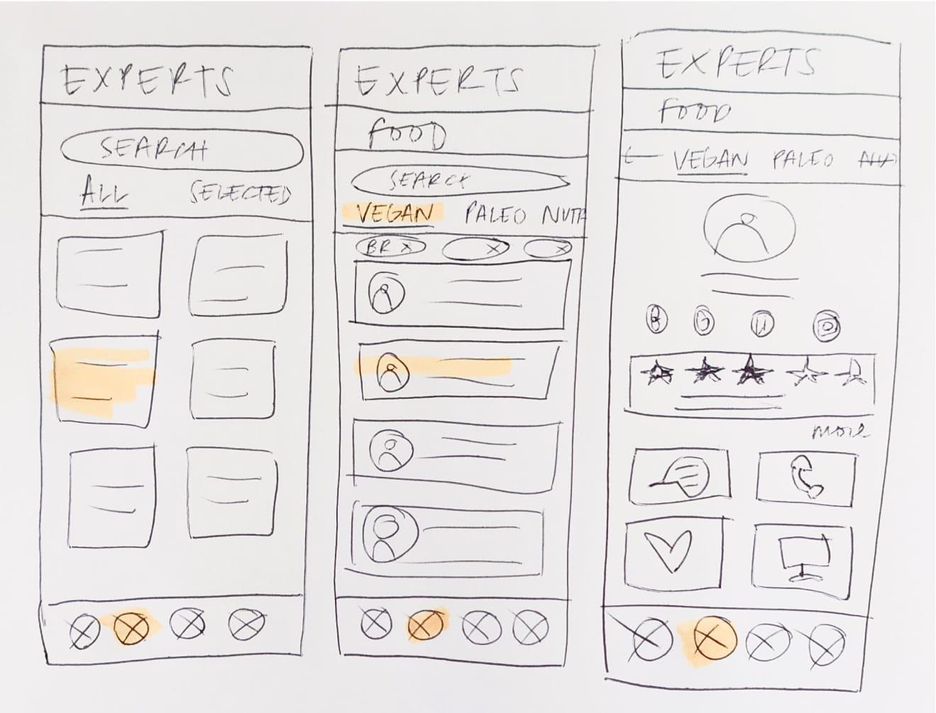
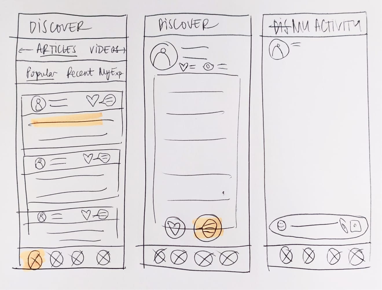
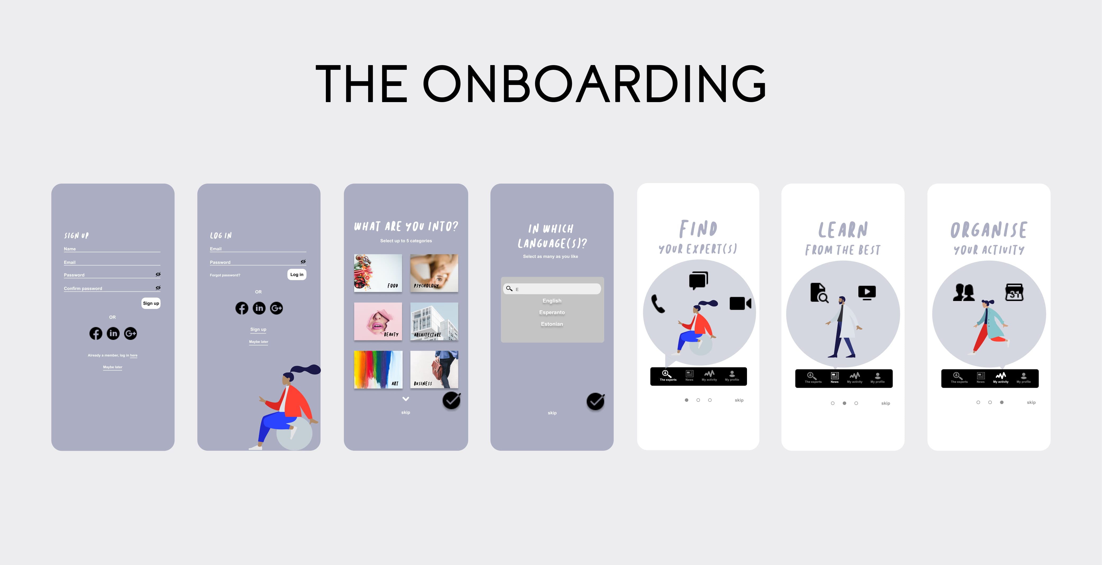
My sitemap layed out, I was now ready to let my initial research and ideas come to life in the form of tangible wireframes and prototypes in order to start testing as soon as possible.
Methodology
Heuristic evaluation | Rapid prototyping | Low-mid fidelity wireframes
Tools
Marvel | Figma
Test | Iterate.
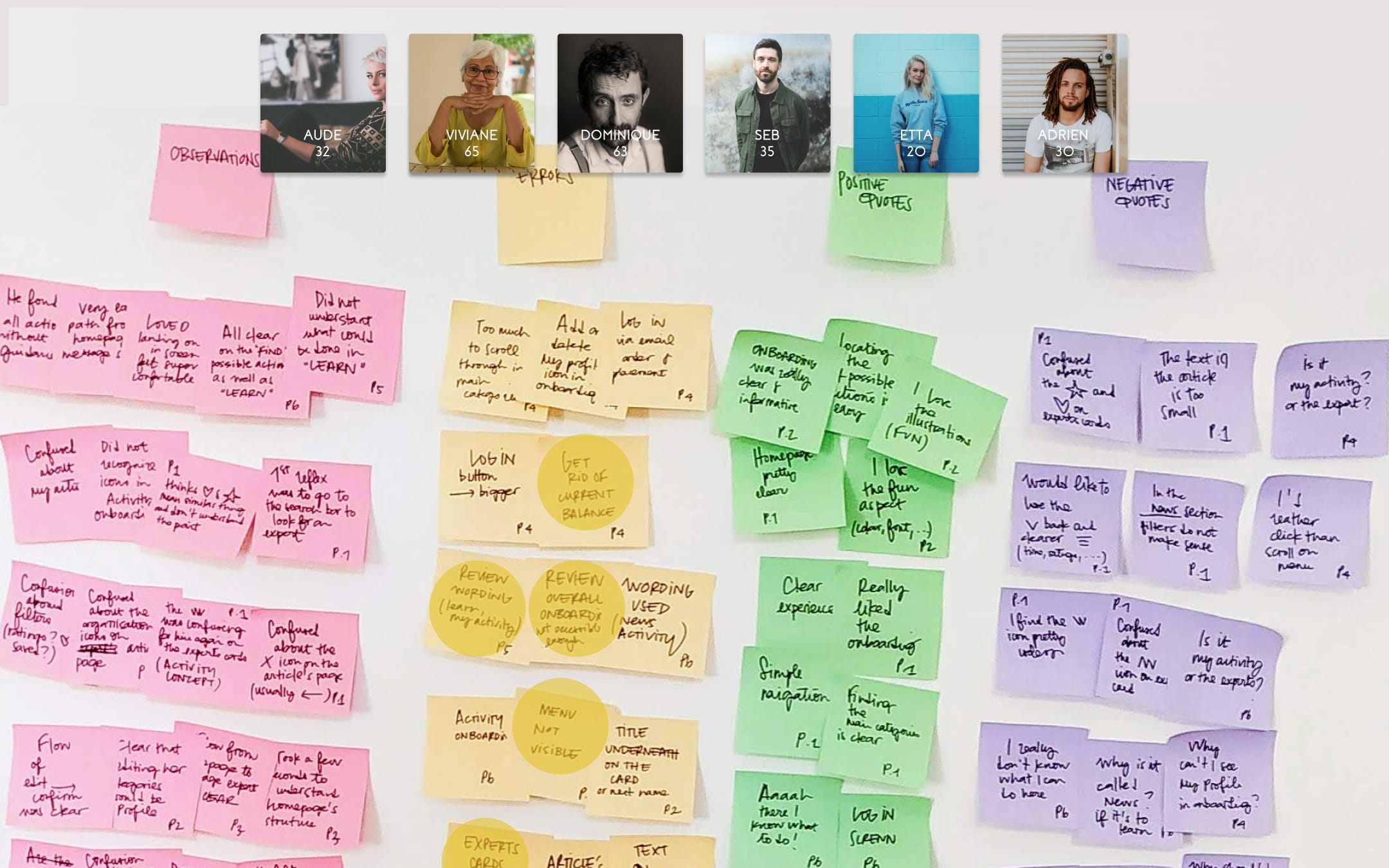
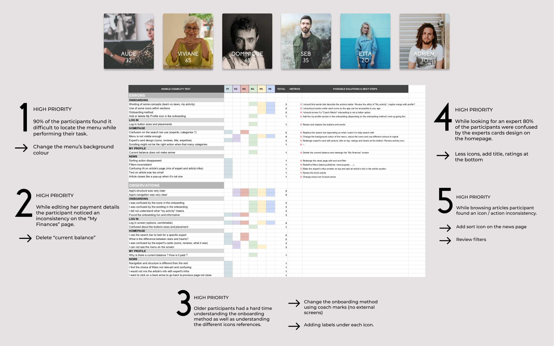
Finally moving on to my favourite part: putting my MVP to the test! In order to validate and evaluate it, I selected a panel of my target users and performed usability tests. Features tested: edit your preferred categories, edit your payment details, find a vegan expert, read and save and article, understand the app's main goals through the onboarding.
Methodology
Moderated remote tests | Rainbow spreadsheet | Affinity mapping | Preference test
Tools
Quicktime | UsabilityHub | Sticky notes
Refine.
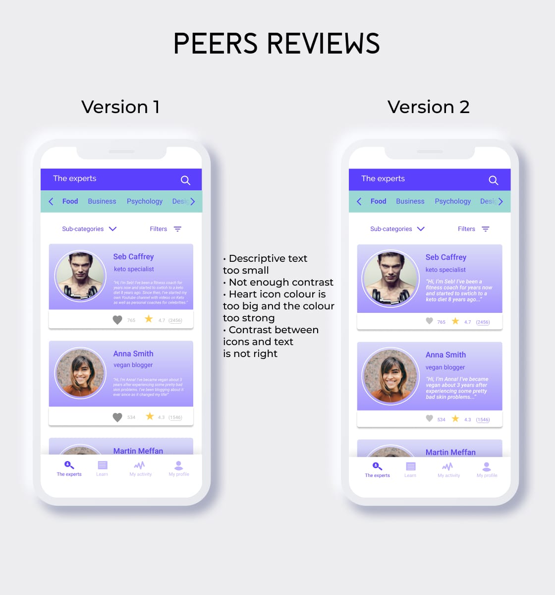
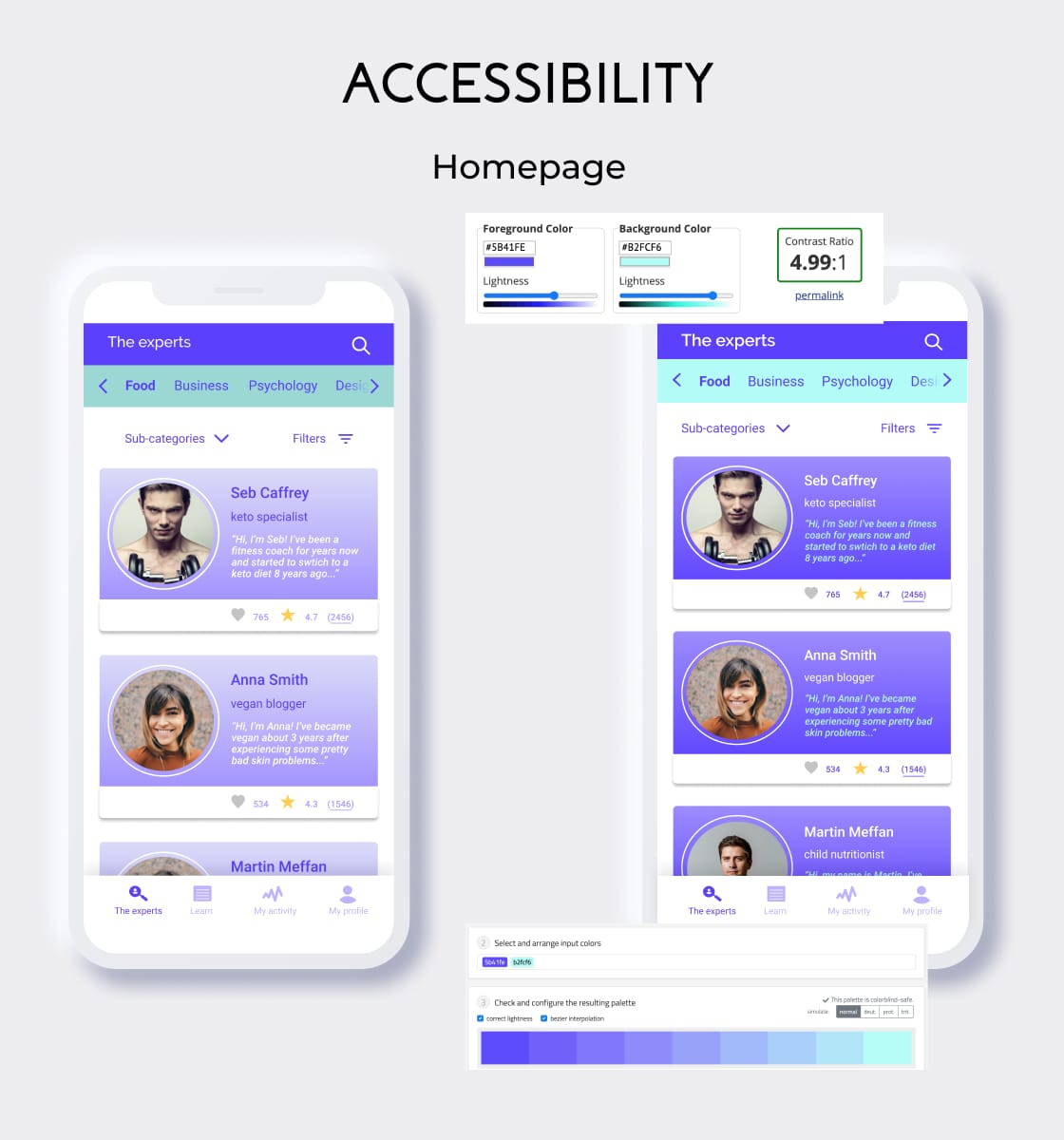
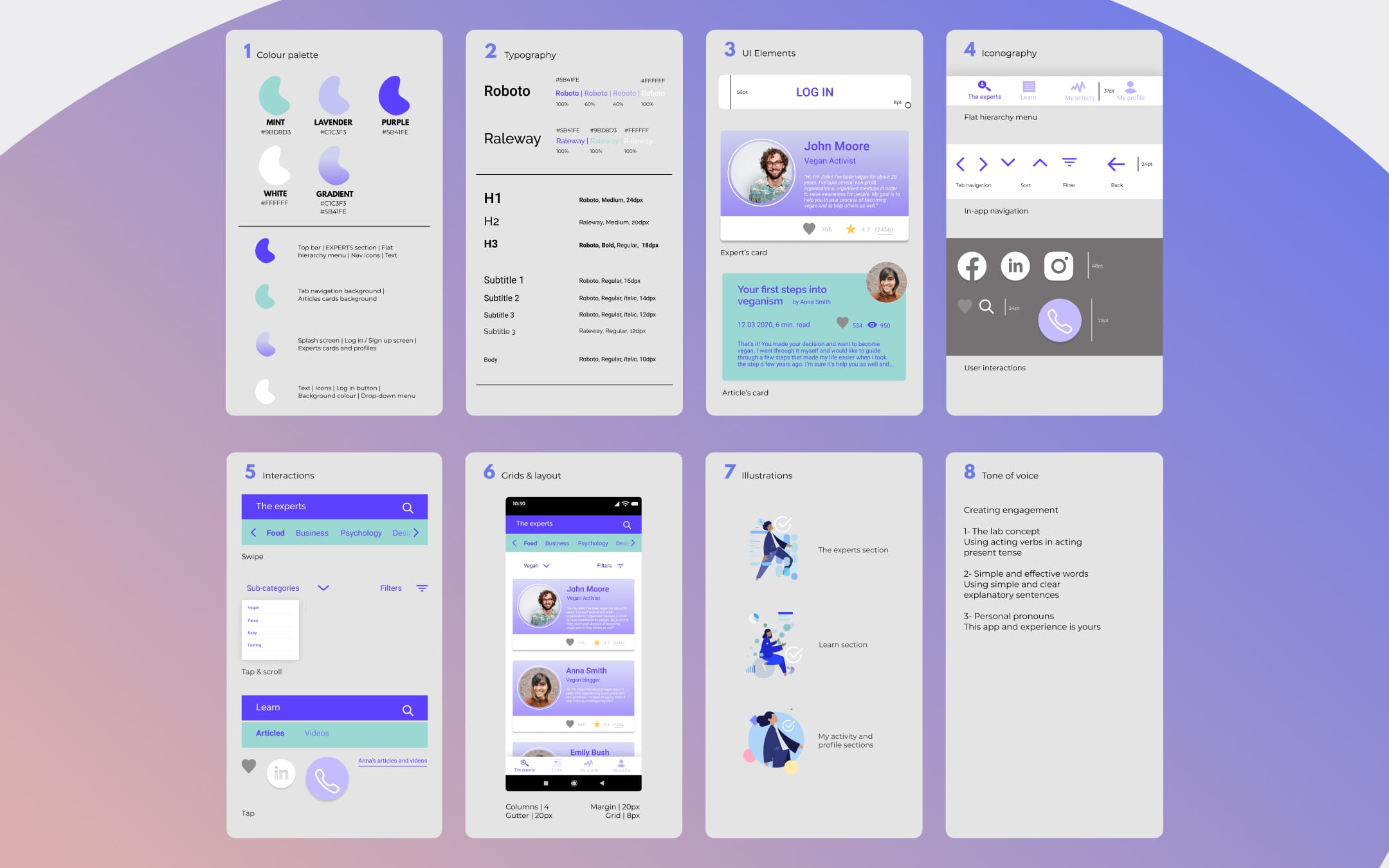
Time to refine my design. Using several emotional design techniques, collaborating with peers as well as applying accessibility guidelines, my design was getting ready to be handed over. Collecting all this information by creating my own design language systems was an important part of the process to keep it consistent and simple to use for any future collaboration.
Methodology
Three levels of design | Accessibility | Peers collaboration
Tools
Slack | WCAG guidelines | Screenomatic
Try it out!
Now is your time to try out the final version of the prototype: scroll, swipe, click and drag. The prototype was done using Figma prototyping tool. You can just give it a go on this page, no need to create an account or enter any info.
